
In: Chandelier
October 12, 2011
Fine Dining
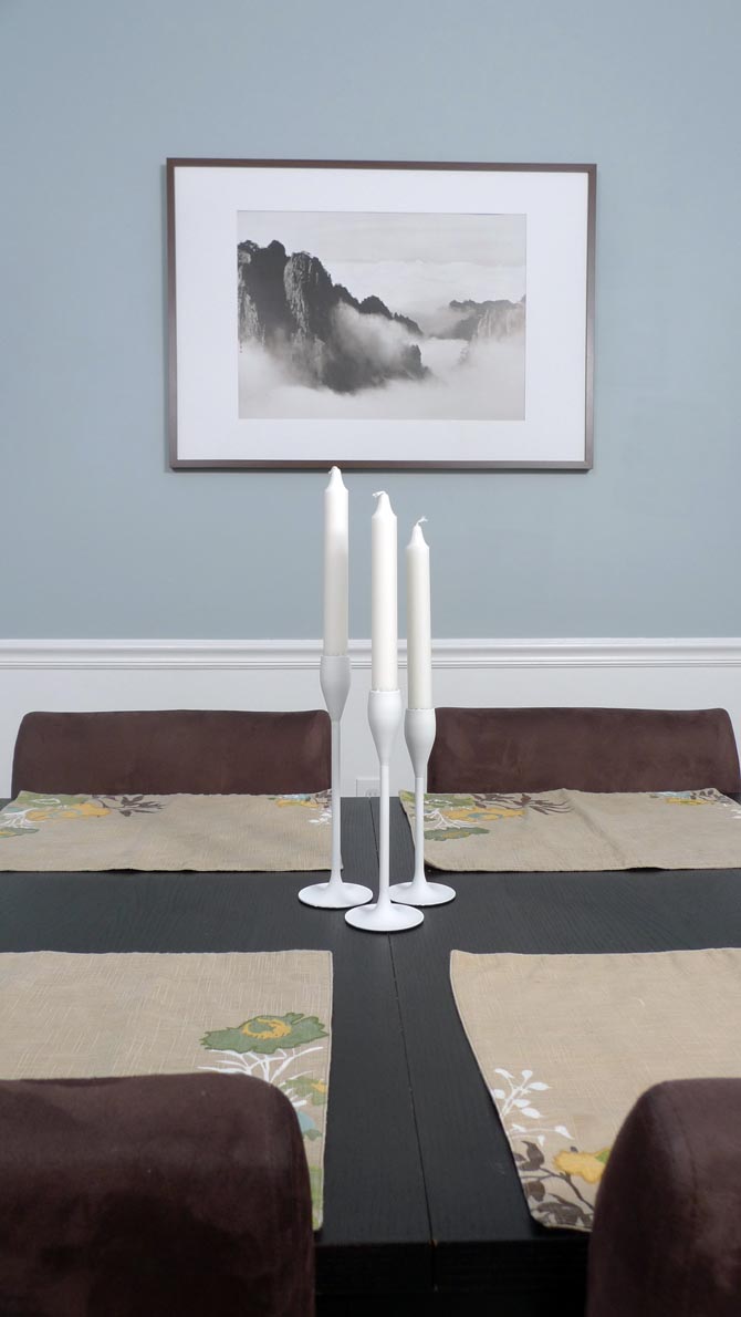
Another makeover is deemed complete. Of course art work is still missing, but those things take time. For now we proudly present the new and improved dining room:

You already learned about our difficult choice of wall paint color here, so let’s move on to some other brand new details. The second place in the category best color improvement goes to … the chandelier.

It went from 90s-brass to modern white in just a few coats of glossy spray paint. Well, of course the guy had to be taken down and primed first, but other than that it was a lot easier than expected. I got primer and paint for not even $15 and spent about 1 hour intermittently spraying outside. So, a lot of bang for you buck and effort. Definitely recommendable to anyone who is currently enduring the outdated view of a brassy chandelier and doesn’t want to spend hundreds on a new one. To spare you all the details of how to spray-paint a chandelier, I’m just gonna link you straight through to my inspirationers over at younghouselove. And this is what my setup outside looked like:

While I was at it, I also sprayed some old frames and candle holders into matching accessories.

Then of course we have the fresh coat of semi-gloss ultra white paint on the trim. While applying it I noticed the unusually bad coverage of the thin paint right before I noticed that I had accidentally bought No-VOC (you know, without the majority of the toxins) paint. That was about the same time when I noticed that this paint was pleasantly unsmelly and I immediately felt so much better breathing in deeply that I might have become a new advocate of this paint. It’s not even that much more expensive anymore than regular paint and much better to use in a household with a young child. Not that I don’t care about my own health, but you know, just watching out for my kid first. The only downside is that it does require one additional coat. In the course of painting the trim I also came up with this nifty trick to reduce cleanup time:

Luckily Martha Stewart had already thought of the same idea, so I didn’t even have to take a photo or write up a lenghty description of a simple thing. More space for other good news.
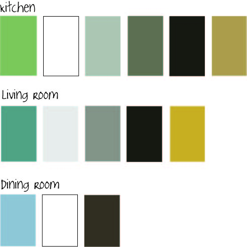
Or the bad ones first. After the whole paint job was done, I drifted into somewhat of a conceptual crisis. While I love the new color of the dining room and also still deeply care for the green kitchen and the teal foyer and the golden curtains, it suddenly was becoming a little bit too much uncoordinated color. Even for me, the color addict. Too much of a good thing can get too much if it is all just thrown together without concept.
I started to learn my lesson that where rooms are well connected like this, you can’t just color-conceptualize room by room. You have to view the entire level as one.
Usually what I do to come up with a color concept is to take an item that I love (could be a blanket, a piece of fabric, a piece of art, etc) and take the colors from there. Basically taking over the color concept somebody else has already won me over with. Kind of like these people over at design seeds do it. This way you know upfront that everything is gonna go well together.
Well, it was kind of too late for that approach. So what now? How about setting the table for a nice dinner and photo shooting?
Yep, you got it. When I was pulling out those place mats (that I got a few months ago at Target on clearance for $2 a piece and love so much that I have been protecting them from spills by hiding in the cabinet) it suddenly all started to make sense:

The green from the kitchen, the blue from the dining room, the brown of the furniture, the golden yellow of the curtains, the white trim – all of them tied together nicely in a nature-themed piece of fabric. The only guy not present is the teal of the foyer, so we all know it will have to be painted over. But that’s a whole other story. For now, let’s cheers and have some good home-cooked meals. For example like tonight’s spaghetti squash. Hmmm….