
In: dining room
October 12, 2011
Fine Dining
Another makeover is deemed complete. Of course art work is still missing, but those things take time. For now we proudly present the new and improved dining room:

You already learned about our difficult choice of wall paint color here, so let’s move on to some other brand new details. The second place in the category best color improvement goes to … the chandelier.

It went from 90s-brass to modern white in just a few coats of glossy spray paint. Well, of course the guy had to be taken down and primed first, but other than that it was a lot easier than expected. I got primer and paint for not even $15 and spent about 1 hour intermittently spraying outside. So, a lot of bang for you buck and effort. Definitely recommendable to anyone who is currently enduring the outdated view of a brassy chandelier and doesn’t want to spend hundreds on a new one. To spare you all the details of how to spray-paint a chandelier, I’m just gonna link you straight through to my inspirationers over at younghouselove. And this is what my setup outside looked like:

While I was at it, I also sprayed some old frames and candle holders into matching accessories.

Then of course we have the fresh coat of semi-gloss ultra white paint on the trim. While applying it I noticed the unusually bad coverage of the thin paint right before I noticed that I had accidentally bought No-VOC (you know, without the majority of the toxins) paint. That was about the same time when I noticed that this paint was pleasantly unsmelly and I immediately felt so much better breathing in deeply that I might have become a new advocate of this paint. It’s not even that much more expensive anymore than regular paint and much better to use in a household with a young child. Not that I don’t care about my own health, but you know, just watching out for my kid first. The only downside is that it does require one additional coat. In the course of painting the trim I also came up with this nifty trick to reduce cleanup time:

Luckily Martha Stewart had already thought of the same idea, so I didn’t even have to take a photo or write up a lenghty description of a simple thing. More space for other good news.
Or the bad ones first. After the whole paint job was done, I drifted into somewhat of a conceptual crisis. While I love the new color of the dining room and also still deeply care for the green kitchen and the teal foyer and the golden curtains, it suddenly was becoming a little bit too much uncoordinated color. Even for me, the color addict. Too much of a good thing can get too much if it is all just thrown together without concept.
I started to learn my lesson that where rooms are well connected like this, you can’t just color-conceptualize room by room. You have to view the entire level as one.
Usually what I do to come up with a color concept is to take an item that I love (could be a blanket, a piece of fabric, a piece of art, etc) and take the colors from there. Basically taking over the color concept somebody else has already won me over with. Kind of like these people over at design seeds do it. This way you know upfront that everything is gonna go well together.
Well, it was kind of too late for that approach. So what now? How about setting the table for a nice dinner and photo shooting?
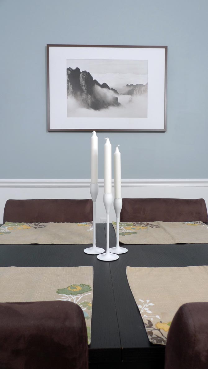
Yep, you got it. When I was pulling out those place mats (that I got a few months ago at Target on clearance for $2 a piece and love so much that I have been protecting them from spills by hiding in the cabinet) it suddenly all started to make sense:

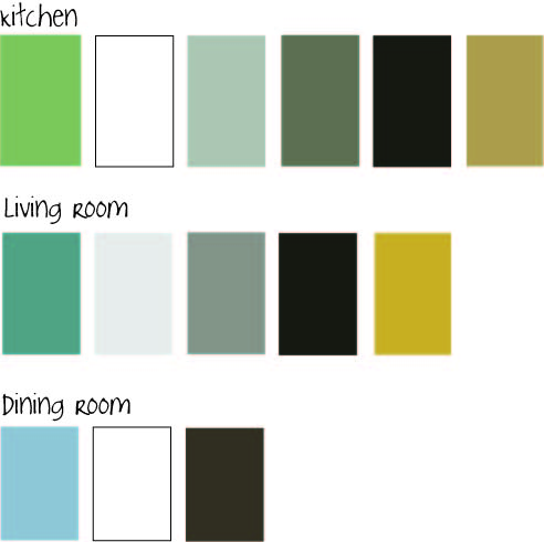
The green from the kitchen, the blue from the dining room, the brown of the furniture, the golden yellow of the curtains, the white trim – all of them tied together nicely in a nature-themed piece of fabric. The only guy not present is the teal of the foyer, so we all know it will have to be painted over. But that’s a whole other story. For now, let’s cheers and have some good home-cooked meals. For example like tonight’s spaghetti squash. Hmmm….
October 9, 2011
The Odyssey
So, there has been some action going on in our living/dining/foyer area lately. You know, just a few little splashes of paint here and there. What started as a dining room makeover and then turned into a foyer makeover has become a whole first floor minus the kitchen makeover. There are so many things to do here that my scatter brain just happily jumps from one project to the next without any clear focus. Whatever feels right is next on the list. Right now I am trying to get all the painting projects done before winter comes and takes away the ability to air out the house without freezing to death.
Updates from the foyer are coming as soon as I finish painting the trim and front door white. But in the meantime let’s switch back to the dining room.
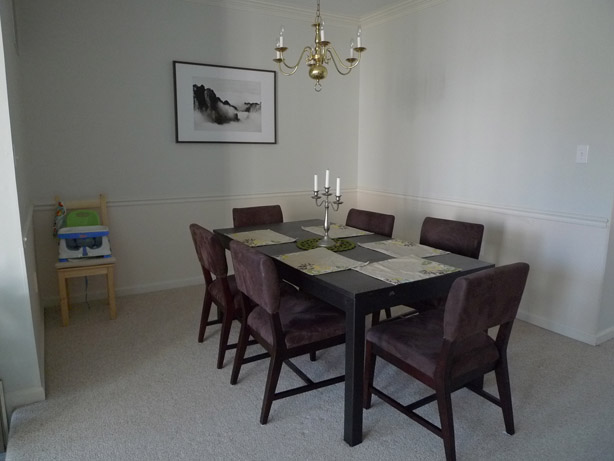
Remember how I got all scared by the boards and batten idea that I would love for the dining room walls? Well, I finally found a good excuse to delay this project indefinitely until we put new floors in our house one day in the distant future. When we install new floors we will have to put up new baseboard anyway, so why go through the trouble installing all these boards now? Exactly! So for now we are keeping the chair rail, will paint the bottom half white, and are adding some color to the top half. And here is where it becomes tricky.
The foyer was already painted a muted dark teal that we love and want to keep. The kitchen is sporting a muted olive green. So the dining room that sits in between those to rooms has to match both colors. So far it has accomplished that by wearing the same neutral light grey as our living room. But we wanted it to stand out as a separate room a little more. However, since the rooms are all well connected, they still have to connect visually somehow. But no more green! Phew, what to do? We were thinking somewhere in the blueish area, muted of course and maybe with a tiny hint of purple in it. Like the clouds on a rainy day. And the sky of the painting in our living room. Read from left – foyer, dining room, kitchen:

So we picked up a bunch of paint chips in that color range and after looking at them for a few weeks in all different lighting situations, we narrowed it down to just a few candidates.

The final winner was “Misty Morning Dew” from Valspar. It had that perfect balance between blue, grey, and purple. Or so it seemed. Because once that baby went up on the entire wall it looked purrrrple like no tomorrow. I can’t say that we didn’t try to let it grow on us or even fall in love with it. But it just didn’t happen. Can’t force love where there is none. The purple was just a tiny bit too funky for us quiet people. So it had to go. (Notice how we turned the table 90 degrees? Not completely decided on the orientation yet, but it definitely opens up a lot more space in the center of the house. The downside is that you have to squeeze your way a bit to the chairs behind the table.)

Well, we didn’t quite feel like buying another bucket of paint either, so I consulted the 15+ paint leftovers in the basement for a solution. Did you know that paint is still in usable condition after 3 years? The only problem is that the can starts to rust and crumble into the paint at some point. Anyway, these were my candidates for a happy mixer event: A pale green, a medium muted teal, and our unloved periwinkle grey.

Together they made this beautiful ice-blue that is now just waiting for the bottom half and the trim to put on a crisp white. More/better pictures to come soon after the trim is finished.

Fits in a little better with the other two colors anyway:

What do you think? Improvement or not? Would you have been daring enough to go with the purplish color? Have you ever experienced a color looking completely different on the wall than on the sample? What did you do about it? Live with it or paint it over?
September 6, 2011
Scary stuff
Holy moly, I just spent almost two hours at Lowes! There is just so much wonderful stuff to see that makes me dream about endless possibilities that are restricted by a tight budget, which I already blew tonight. No more spendings for the the rest of September. But the supplies I got should last for a good while and for a bunch of projects that are lined up.
Originally I thought that the dining room is gonna be the next candidate for a makeover. It still had that somewhat tolerable wallpaper, but stood there kind of bland and blah in the middle of our house ad wouldn’t quite fit in with the kitchen and living room. So within only 1.5 hours I was able to pull off an unexpectedly smooth wall paper removal, and was left staring at even more boring walls. What to do, what to do .. let’s ask Pinterest. And there I found this fine little piece of inspiration:

Board and Batten is what it’s called. Never heard of it before, but I’ll take it. Supposedly it is a very simple project that involves only cutting some boards and nailing them to the wall. But then again, it looks like a lot of board cutting and nailing and caulking corners and painting. So I got a little intimidated by the whole thing. Actually quite a bit intimidated. A lot. Scared almost. But I still want it.
To escape this scary room, I quickly moved on to another smaller project. The foyer. While this is the only room where we totally love the wall color and coat hooks were already installed, at first glance it doesn’t look like it needs a lot of work.
But then look a little closer:
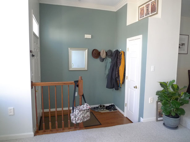
1st problem: Bags are hanging out at the banister, shoes pile up on the floor. Solution: Add storage for bags and shoes. Simple as that.
2nd problem: The banister is ugly. Too oaky, to traditional, and it kind of feels like you walk straight into it when coming into the house. Unfortunately right now it is doing a good job keeping Milo and his toys from falling down the step, so it will have to stay until there are no more little toddlers toddling around. Solution: Paint it white to blend in with the other trim.
3rd problem: The trim isn’t even white. Solution: Just bought a heavy gallon full of ultra white semi-gloss paint.
4th problem: There is an unsightly door bell box hanging in the middle of the wall. Solution: Not sure. What do you suggest?
5th problem: The wall art above the closet is very generic. The only thing it has going for it is that it fits perfectly shape wise. Solution: Change the picture and add something 3dimensional.
6th problem: The ceiling light is not in the photo. But trust me, it is not worth it taking another photo. Solution: Maybe in the long run switch it out for a nice (possibly DIYed) pendant light that ties in the high ceiling a little better.
That reminds me – it’s almost Halloween. Time to get some fall craft going and breaking out some scary moves myself. How about you guys? In the mood for some easy foyer fixing upping? What ideas do you like to make this practical room a little more pretty?