So, there has been some action going on in our living/dining/foyer area lately. You know, just a few little splashes of paint here and there. What started as a dining room makeover and then turned into a foyer makeover has become a whole first floor minus the kitchen makeover. There are so many things to do here that my scatter brain just happily jumps from one project to the next without any clear focus. Whatever feels right is next on the list. Right now I am trying to get all the painting projects done before winter comes and takes away the ability to air out the house without freezing to death.
Updates from the foyer are coming as soon as I finish painting the trim and front door white. But in the meantime let’s switch back to the dining room.
Remember how I got all scared by the boards and batten idea that I would love for the dining room walls? Well, I finally found a good excuse to delay this project indefinitely until we put new floors in our house one day in the distant future. When we install new floors we will have to put up new baseboard anyway, so why go through the trouble installing all these boards now? Exactly! So for now we are keeping the chair rail, will paint the bottom half white, and are adding some color to the top half. And here is where it becomes tricky.
The foyer was already painted a muted dark teal that we love and want to keep. The kitchen is sporting a muted olive green. So the dining room that sits in between those to rooms has to match both colors. So far it has accomplished that by wearing the same neutral light grey as our living room. But we wanted it to stand out as a separate room a little more. However, since the rooms are all well connected, they still have to connect visually somehow. But no more green! Phew, what to do? We were thinking somewhere in the blueish area, muted of course and maybe with a tiny hint of purple in it. Like the clouds on a rainy day. And the sky of the painting in our living room. Read from left – foyer, dining room, kitchen:

So we picked up a bunch of paint chips in that color range and after looking at them for a few weeks in all different lighting situations, we narrowed it down to just a few candidates.

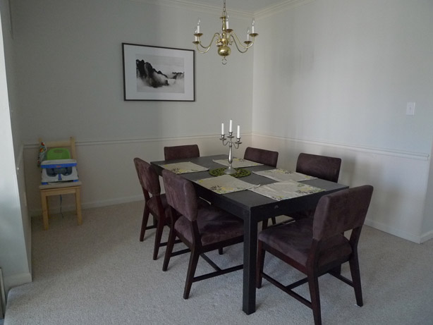
The final winner was “Misty Morning Dew” from Valspar. It had that perfect balance between blue, grey, and purple. Or so it seemed. Because once that baby went up on the entire wall it looked purrrrple like no tomorrow. I can’t say that we didn’t try to let it grow on us or even fall in love with it. But it just didn’t happen. Can’t force love where there is none. The purple was just a tiny bit too funky for us quiet people. So it had to go. (Notice how we turned the table 90 degrees? Not completely decided on the orientation yet, but it definitely opens up a lot more space in the center of the house. The downside is that you have to squeeze your way a bit to the chairs behind the table.)

Well, we didn’t quite feel like buying another bucket of paint either, so I consulted the 15+ paint leftovers in the basement for a solution. Did you know that paint is still in usable condition after 3 years? The only problem is that the can starts to rust and crumble into the paint at some point. Anyway, these were my candidates for a happy mixer event: A pale green, a medium muted teal, and our unloved periwinkle grey.

Together they made this beautiful ice-blue that is now just waiting for the bottom half and the trim to put on a crisp white. More/better pictures to come soon after the trim is finished.

Fits in a little better with the other two colors anyway:

What do you think? Improvement or not? Would you have been daring enough to go with the purplish color? Have you ever experienced a color looking completely different on the wall than on the sample? What did you do about it? Live with it or paint it over?
1 Comment
Leave A Comment