
In: Paint
July 31, 2012
Man Cave
Who would have thought that my man is so susceptible to advertising? When I picked up a paint swatch for our basement accent wall that was called “Man Cave”, he was all of a sudden so set on using that color even though it was way darker and brownish than what we were looking for. He also bought dog snacks for his parent’s dogs just because they are called “Milo’s Kitchen”. Just name things something that are meaningful to him, and he will buy them.
But side notes aside – this post is about the preliminary finished status of our big basement makeover. Here is a quick reminder of what it used to look like and the plans we had for it:
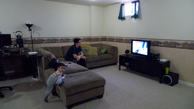
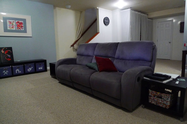
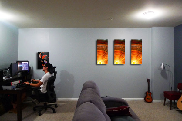
And here is the for-now-final result:

This project was really more Lincoln’s than mine, since I was getting too pregnant to help with any laborious work, he spends way more time down there anyway, and wanted it to become his very own man cave. A space where he can make the manlier design choices and that is totally technically geared up. So all I had to do was motivating him to get things done before baby arrives, help to strip down some wall paper, and moderate his design just a little bit.
Preparation
The wall paper removal and painting was the more tedious and painful part, but we had a pretty good system down (learned from the guest room makeover) and managed to finish it within two weeks (working on it almost every evening). For the walls we chose a light grey that was supposed to be color-matched to the guest bedroom walls, but turned out a little darker and blueish. Oh well, close enough for now. Therefore the darker accent wall also had to have a blueish grey undertone. We chose “Iron Frame” from Valspar and had it successfully color matched to Olympic No-VOC.
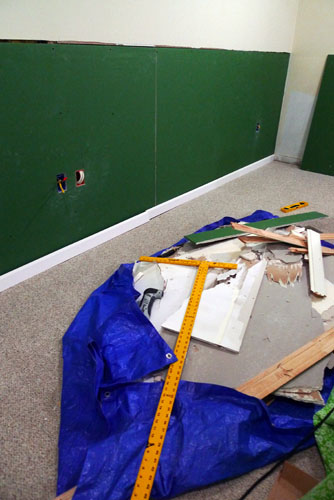
Before painting however, we had to add some more outlets to the room. There had been only three accessible outlets so far and they were both overloaded by numerous computer and TV components. This required Lincoln to take down the bottom half of one basement wall board, but the good news was that this extra step enabled us to inspect insulation levels and we were also relieved to find no mold or other moistures issues in the basement even though both our neighbors’ basement had been flooded recently.
Lincoln also added wiring for the future surround sound movie theater setup he has envisioned and laid the cables for that behind the baseboards around the room.
Furniture and Features
We bought all new furniture (except for the desk) from IKEA and the couch was a sale item from a local furniture store.
- This couch was a total score and is super comfy with memory foam, dual recliners, and all.
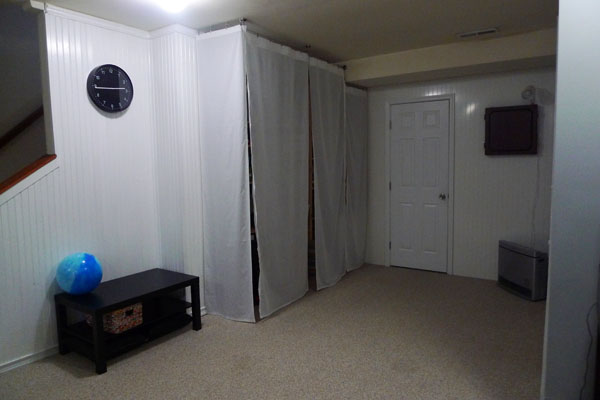
- We also concealed our messy storage shelf for all office and hobby related items. Considering the limited time and energy we had for this project we did not create a real built in closet as originally planned, but hung up a simple curtain solution from IKEA to make the mess disappear when needed.
 .
.
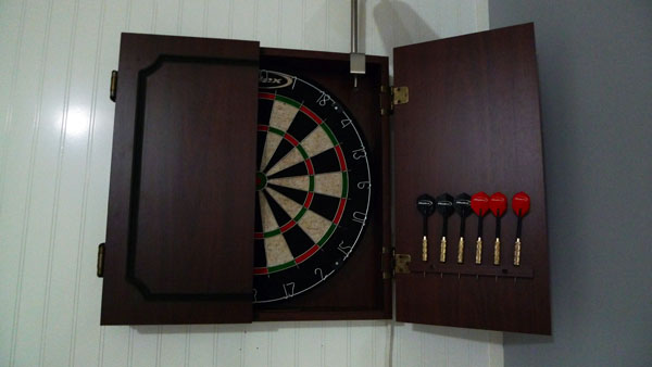
- Lincoln bought himself this long-wanted dart board cabinet. I am still trying to convince Lincoln to paint this thing the same blue-grey color as the accent wall to make it look less country.
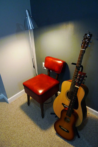
- This vintage red Vinyl chair was a find at Goodwill. It even has a storage compartment in the seat – just to my liking. You can never have enough storage space.
 .
.
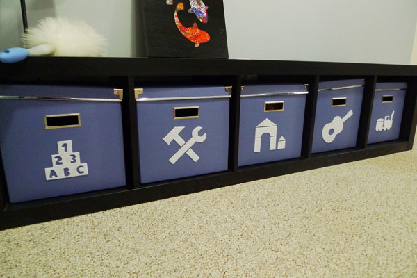
- One of the long IKEA Expedit book cases with boxes to house Milo’s toys. They are now organized by similarity and the labels I cut out of sticky felt indicate even to illiterate little toddlers which toys to find in which box and in which one they need to be put back in. Eventually I might add some cushions on top of it for additional seating.
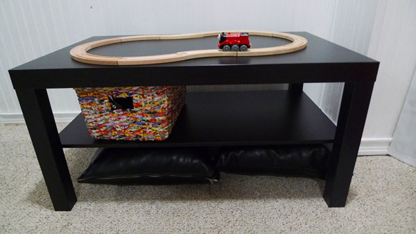
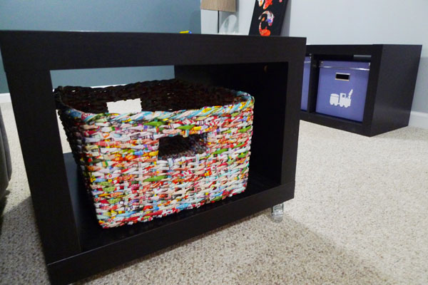
- A smaller play table. Yes, that’s right, I finally sold that big hunk of ugly orange laminate train table. This little one provides enough space for drawing, building block houses, and driving cars on it while fitting in much nicer. Whenever I get to it I will add some table toppings for different activities. Maybe a thin chalk board, a lego base plate, a traffic pattern, or other ideas as seen on this pin board. The trains are now being set up on the floor whenever needed and we can create much larger configurations.
- Also, check out these cool baskets made out of woven recycled newspaper ads from China. They are nicely speckled and colorful to bring in some pop. And they fit perfectly into our side tables to hold magazines, remotes, etc. And yes, it totally bothers the color perfectionist in me how the purplish blue of the toy bins does not match anymore with how the grey-blue paint of the wall turned out. But I will not spend any more money right now, so suck it up, Nicola.
- Lincoln’s desk remained as the only old piece of furniture, but was upgraded with a self-made hutch and a giant contraption to hold his two monitors, before it moved to a more suitable location on the short wall by the laundry room.
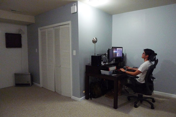
For now the furniture arrangement is still focused on the TV, but it will change a little bit once the home theatre including projector and big screen will be implemented. The sofa will then move to the large light grey wall in the back, and the screen will go up above the toy bench.
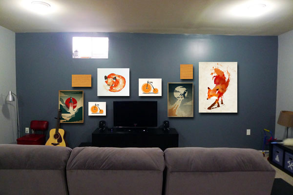
Art
The color scheme for the basement is quite different from our upstairs. Much brighter, colorful, and saturated. And there is even some red involved – my so not favorite color. But what can I say … the basement is a whole different zone. A man cave. And it is manly enough to be able to handle some red.
After deciding on a blueish grey backdrop of the walls, some more color was definitely called for and we found inspiration in these pictures painted by Milo:
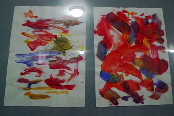
The red, orange, and yellow, make for a nice contrast to the cool blue. I also used one of Milo’s paintings for this first official piece of man cave art:
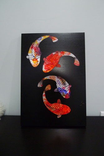
Just use a kids painting (ideally let them use only three colors, otherwise everything will turn brown eventually), put it in the printer, print some outlines on it, cut them out, and glue on a wood board from the IKEA As-Is section. This board cost me only $1 and the fish were free. See, I couldn’t have painted such a completely random pattern on the fish even if I tried.
We will definitely need lots and lots more of some cool art for the huge amount of walls down there.
Maybe arranged like this photoshopped vision:
With some cool art from this website.
Future Plans
Still missing and on the definite list to be done:
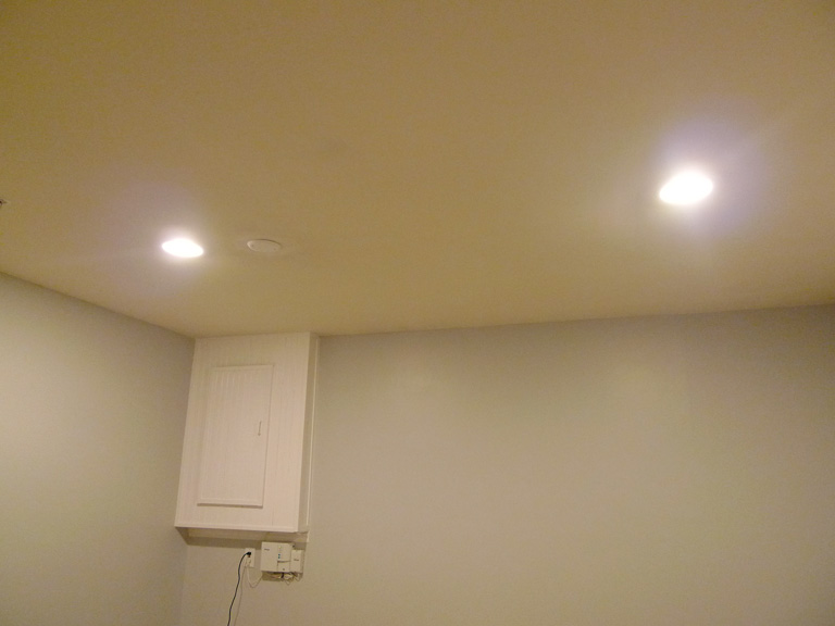
- Improve the lighting situation. The current ceiling fixtures are still too dim and in impossible locations.
- Get some lamps for the side tables for moody lighting when no complete illumination is needed.
Phew, our biggest project yet. So glad to be done for now.
April 10, 2012
Welcome Back!
We did it! One day before our house was populated by some German visitors we officially finished the new guest bedroom in the basement and I have to say that it turned out great. We have been working on this for approximately six weeks and it was a real joint effort in the Tran house. Without my handyman I – the surface pretty maker – could not have done such serious handy work as installing lights and new drywall. Looking back, we actually accomplished a lot more than I dared to hope for in my original post about the basement plan. Here is the gist of it.
Just a reminder – this was the colorful craziness we had bought into a year ago:

And this is the new toned down guest oasis:

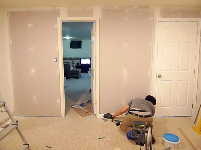
On our way to the final result we encountered many tedious tasks, such as removing wall paper with lots of water, vinegar, and persistant scraping.
Priming the walls with No-VOC primer because there is not much opportunity for ventilation down there and we did not quite want the baby to be born a natural paint addict.
Splitting the room’s lighting from the overall basement circuit and installing two new recessed lights instead of the one dim boob light.
For the sake of installing the new light switch in the room we also decided to take down the bead board paneling on one of the walls which we had never quite understood why it was there.


After taking it down we realized why it was there: Because the previous owners installed the wall framing flush with an existing corner and putting up drywall would have made for an ugly overlapping edge.

Which left us with the exact same problem – how were we gonna accomplish a smooth wall with drywall. Our solution: Using extra thin drywall and extend it to the part around the door over the existing drywall. Not exactly the Holmes-on-Homes way to do it, but good enough.
The trim and doors in this room were wearing many different shades of yellowed old white, so they got a fresh white coat as well .
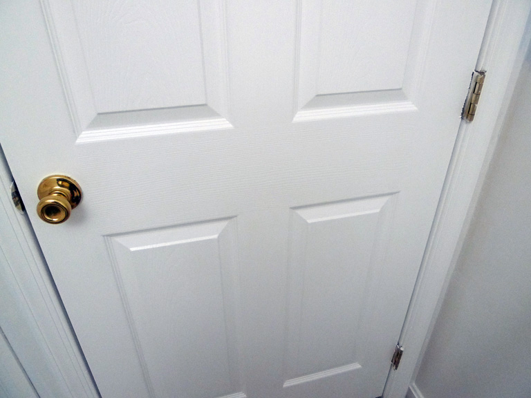
I didn’t even have to bother with taping off the door hardware because on my mission to de-brassify this house and bringing it entirely to the 20th century I also switched out all the door knobs and hinges for brushed nickel ones.

On the final stretch I got sick and my awesome hubby had to paint the room all by himself with the perfect shade of light grey that I had found on the oops-paint rack at Lowes for $5 (and even No-VOC!). It’s amazing what a difference No-VOC paint makes. It might take an additional coat, but the smell during application is minimal and the next day the room is absolutely smell free.

It is actually a little lighter than shown in this photo (more like what you see next to the door above):

Finally, we cleaned the carpet and filled the room with all the existing stuff from the old guest room, plus a yard sale chair and a free dresser.


We are gonna hang some more framed postcards to fill the back wall, add a bookshelf and wall art to the reading corner, Â and eventually also have to find a prettier solution for the electric box and modem corner:

But so far it is the most finished bedroom in our house and I am seriously worried that I won’t ever see my husband in our own bedroom again.
October 9, 2011
The Odyssey
So, there has been some action going on in our living/dining/foyer area lately. You know, just a few little splashes of paint here and there. What started as a dining room makeover and then turned into a foyer makeover has become a whole first floor minus the kitchen makeover. There are so many things to do here that my scatter brain just happily jumps from one project to the next without any clear focus. Whatever feels right is next on the list. Right now I am trying to get all the painting projects done before winter comes and takes away the ability to air out the house without freezing to death.
Updates from the foyer are coming as soon as I finish painting the trim and front door white. But in the meantime let’s switch back to the dining room.
Remember how I got all scared by the boards and batten idea that I would love for the dining room walls? Well, I finally found a good excuse to delay this project indefinitely until we put new floors in our house one day in the distant future. When we install new floors we will have to put up new baseboard anyway, so why go through the trouble installing all these boards now? Exactly! So for now we are keeping the chair rail, will paint the bottom half white, and are adding some color to the top half. And here is where it becomes tricky.
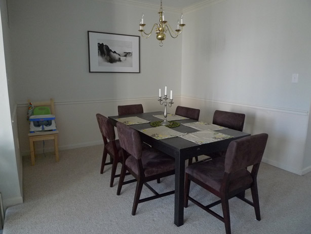
The foyer was already painted a muted dark teal that we love and want to keep. The kitchen is sporting a muted olive green. So the dining room that sits in between those to rooms has to match both colors. So far it has accomplished that by wearing the same neutral light grey as our living room. But we wanted it to stand out as a separate room a little more. However, since the rooms are all well connected, they still have to connect visually somehow. But no more green! Phew, what to do? We were thinking somewhere in the blueish area, muted of course and maybe with a tiny hint of purple in it. Like the clouds on a rainy day. And the sky of the painting in our living room. Read from left – foyer, dining room, kitchen:

So we picked up a bunch of paint chips in that color range and after looking at them for a few weeks in all different lighting situations, we narrowed it down to just a few candidates.

The final winner was “Misty Morning Dew” from Valspar. It had that perfect balance between blue, grey, and purple. Or so it seemed. Because once that baby went up on the entire wall it looked purrrrple like no tomorrow. I can’t say that we didn’t try to let it grow on us or even fall in love with it. But it just didn’t happen. Can’t force love where there is none. The purple was just a tiny bit too funky for us quiet people. So it had to go. (Notice how we turned the table 90 degrees? Not completely decided on the orientation yet, but it definitely opens up a lot more space in the center of the house. The downside is that you have to squeeze your way a bit to the chairs behind the table.)

Well, we didn’t quite feel like buying another bucket of paint either, so I consulted the 15+ paint leftovers in the basement for a solution. Did you know that paint is still in usable condition after 3 years? The only problem is that the can starts to rust and crumble into the paint at some point. Anyway, these were my candidates for a happy mixer event: A pale green, a medium muted teal, and our unloved periwinkle grey.

Together they made this beautiful ice-blue that is now just waiting for the bottom half and the trim to put on a crisp white. More/better pictures to come soon after the trim is finished.

Fits in a little better with the other two colors anyway:

What do you think? Improvement or not? Would you have been daring enough to go with the purplish color? Have you ever experienced a color looking completely different on the wall than on the sample? What did you do about it? Live with it or paint it over?
July 15, 2011
The tree is up
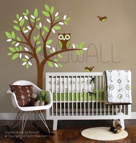
Here is an update on the tree that I painted on Milo’s wall. It all didn’t quite go as planned, but I kind of like the result. My very first idea was to buy a tree wall decal and save all the work of painting. Then I decided against spending money and for painting. But, I didn’t want to risk to free-style it, so I went to look for inspiration on Pinterest and Dr. Google. This is what I was intending to replicate, minus the owl:
When I started drawing the outline on the wall with a pencil (chalk would have been better, but didn’t have any on hand), I realized that I didn’t really care for the curvy branches and wanted to keep the tree more straight and edgy. In the course of changing the direction of this tree an entire eraser lost its life and I did end up free-styling the thing. (more…)
June 25, 2011
The place where food happens
Finally, our kitchen renovation is done. But let’s start from the beginning. Here is what our kitchen looked like when we first met it:

Before
Absolutely hideous, right? In retrospect I can’t believe we even bought the house. This awful combination of early nineties wallpaper with all white cabinets, counters, and wooden country touch to it would surely kill any appetite if I had to live in it. (more…)